

The Psychology of Colour in CGI: Shaping Emotion Through Hue
In the visually driven world of CGI, colour is far more than a stylistic decision—it’s a powerful psychological tool that shapes how we interpret space, story, and mood. From animated films to architectural renders, the hues chosen by digital artists are often laden with meaning, carefully selected to evoke emotion, influence perception, and reinforce narrative.

Psychologists have long understood the connection between colour and feeling. Red suggests urgency or passion; blue, calm and reliability; yellow, optimism or caution. These associations are not lost on CGI creators, who use colour to communicate emotional context without a single word of dialogue. In cinema, this is evident in films like The Matrix, where a sickly green tint permeates the digital world, subtly reinforcing its artificial, oppressive nature. Similarly, Pixar’s Inside Out assigns each emotion a distinct colour palette, helping audiences subconsciously track mood and motivation.
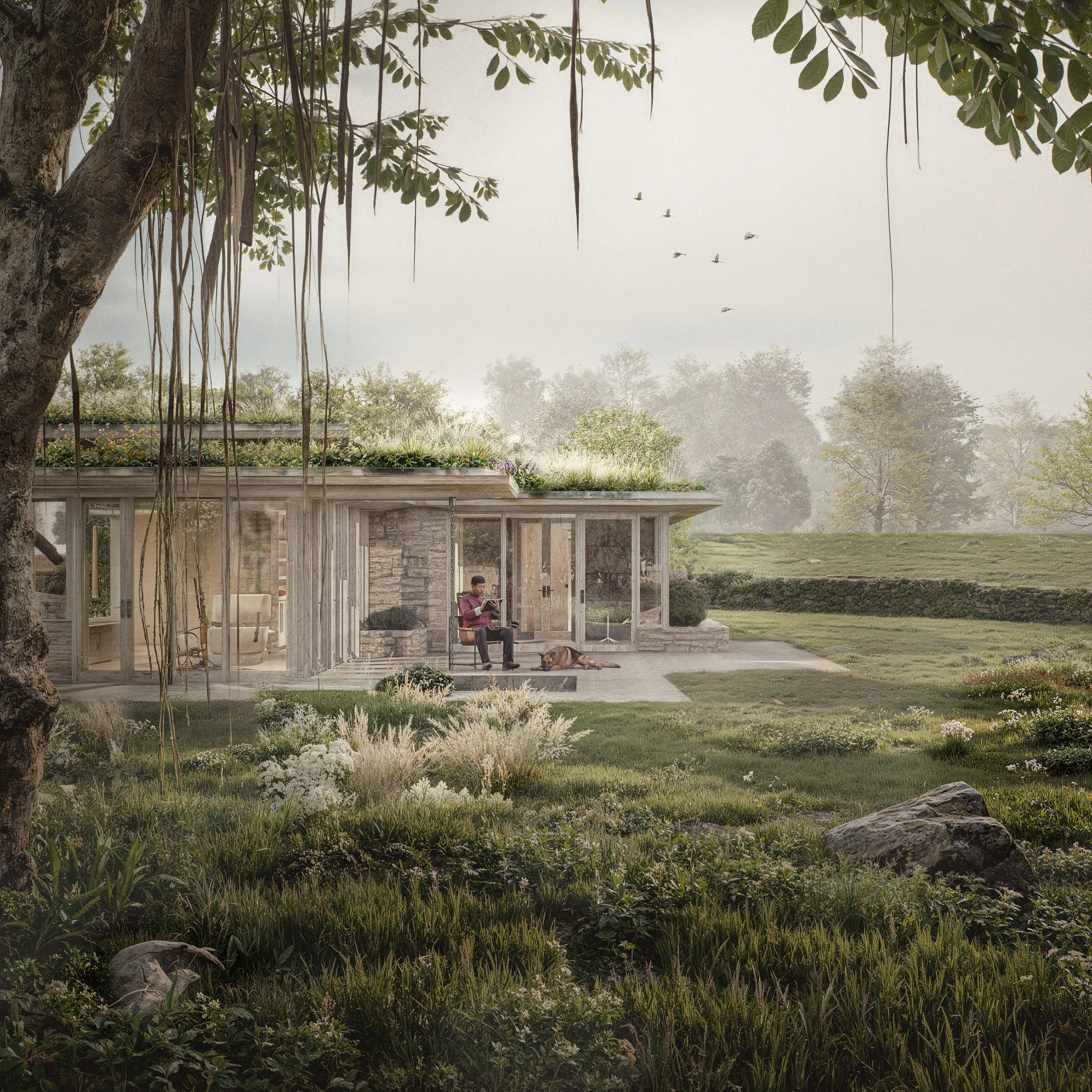
In architectural visualisation, colour becomes an even more deliberate tool. A soft, neutral palette might make a home feel warm and liveable, while cooler greys and desaturated blues can lend a sense of minimalism, cleanliness, or even detachment. Light plays a critical role, too—not just in achieving photorealism, but in conveying emotional tone. A room bathed in golden hour light feels safe and nostalgic, while the same space under overcast skies might feel cold or corporate. These visual choices influence how viewers respond emotionally to spaces they may never physically enter.
The power of colour extends beyond atmosphere to commercial effectiveness. In advertising and branding, CGI is frequently used to create bold, eye-catching visuals. Here, colour psychology takes centre stage. A luxury brand might lean into deep blacks and golds to signify exclusivity, while a tech company opts for cool blues to suggest intelligence and trust. In animated commercials, high-saturation hues are often exaggerated to captivate audiences, triggering feelings of excitement or comfort before a product is ever mentioned.
With the emergence of real-time rendering and AI-driven workflows, artists now have unprecedented control over colour. Live adjustments to tone and mood can be made on the fly, allowing creators to experiment freely with how colour affects emotional impact. The tools are faster and smarter, but the goal remains the same: to make viewers feel something.
Colour is more than decoration in CGI—it’s a silent narrator. It sets the emotional temperature of a scene, directs the viewer’s attention, and breathes life into digital spaces. As technology evolves, the ability to wield colour effectively will remain a mark of great digital storytelling.